


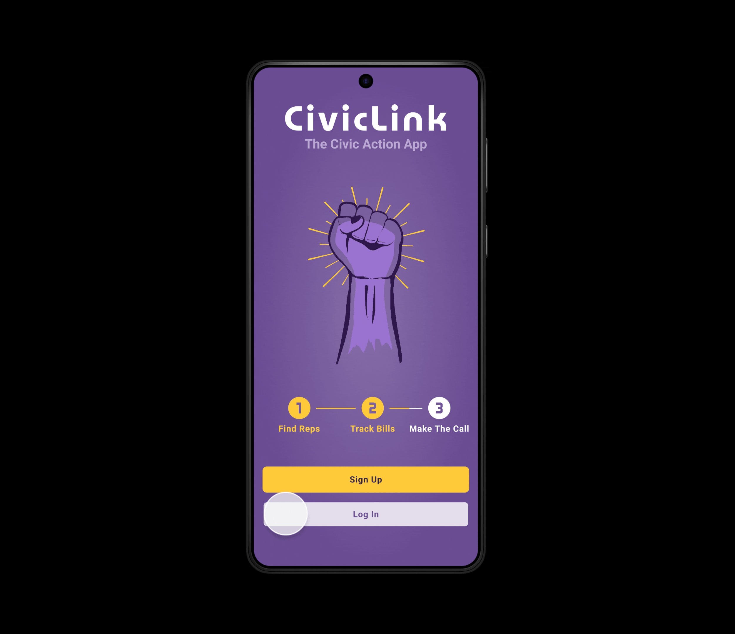
CivicLink
The Civic Action App
CivicLink is a mobile app designed to bridge the gap between citizens and their local governments. By simplifying access to civic information and enabling community participation, CivicLink aims to make civic engagement more approachable and inclusive.
Role: UX Designer
Tools: Figma, GIMP 3, Inkscape, Loom
Project Type: Self-initiated design mock
Methodology: UX Research, Interaction Design, Accessibility

Discover
Understanding the Problem
The Challenge
In an era of constant news alerts, social media noise, and polarized discourse, many individuals feel disconnected and powerless within the democratic process. Overloaded by information and confused by opaque government systems, people are unsure how to meaningfully engage with the issues that matter to them.
User Research
Participants: 6 user interviews (ages 25–60), moderate-to-liberal voters across U.S. districts
Methods: Interviews, surveys, secondary research, and competitive analysis
Users felt disempowered by complex political systems and unsure how to engage
Users rely heavily on social media and hearsay for civic information
Overwhelming information made it hard to prioritize relevant action
People struggled to identify their representatives or track related legislation
Many are unclear on what each level of government actually does
There was a strong desire for simplified tools and plain-language explanations
Key Findings
Plain-language content improves trust, confidence, and engagement
Users value personalized information tied to location and interests
Trustworthy, centralized tools help reduce confusion
Timely reminders and actionable content drive participation
People are more likely to act when they see clear, meaningful outcomes
Core Insights
Competitive Audit
BallotPedia.org

Rich in content, but overwhelming and poorly guided
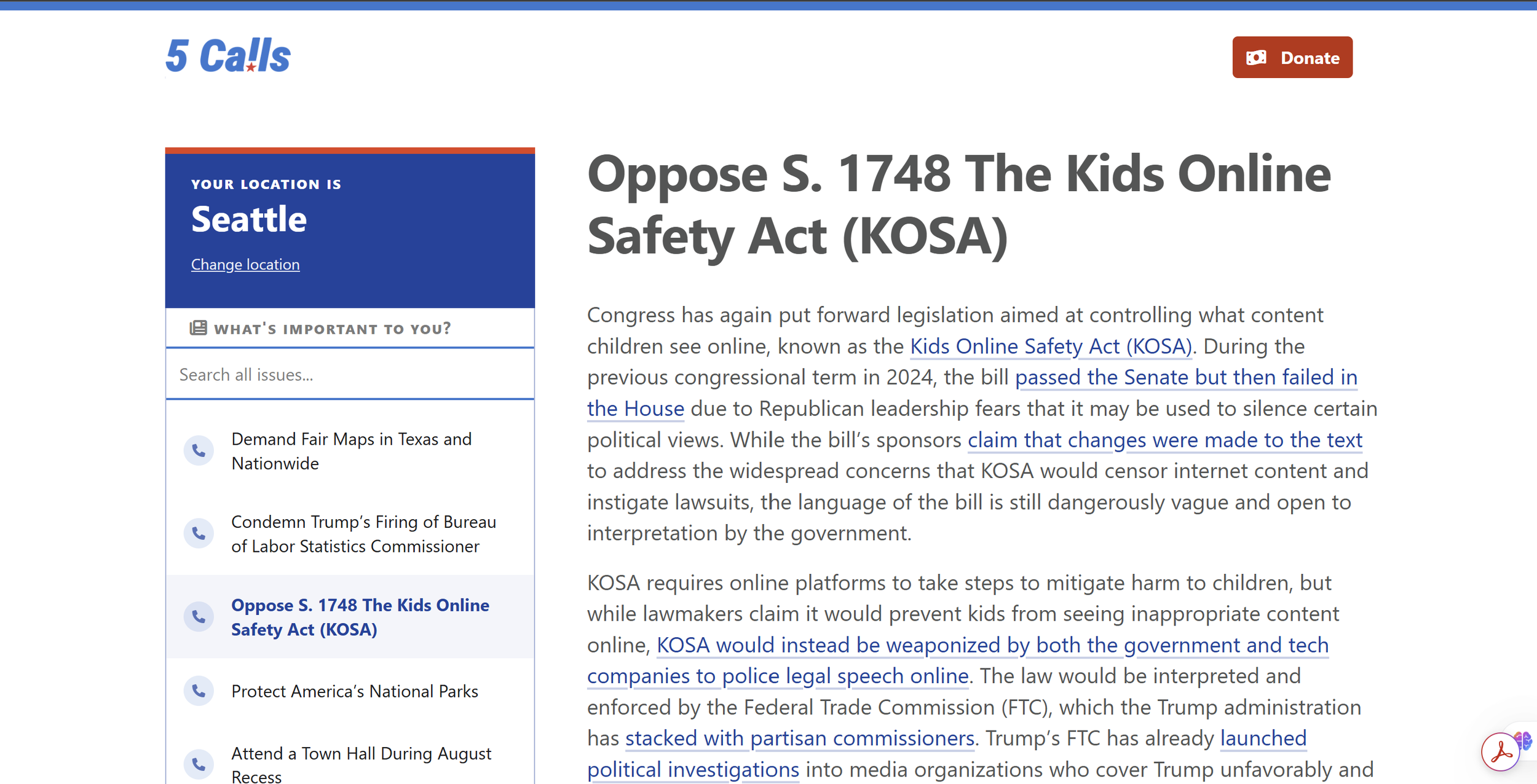
5 Calls
Actionable and simple, but limited in issue depth
GovTrack.us

Strong legislative data, but lacks personalization and action pathways
Define

Framing the Problem
User Pain Points
Difficulty Tracking Relevant Legislation
Users struggle to keep track of bills and legislation that align with what matters to them, making it hard to stay informed on key issues that are currently being considered.
Lack of Clear Actionable Steps
Users want to take action but are uncertain about how to contact their representatives or what to say, resulting in a feeling of political inaction.
Trouble Identifying Representatives
Users often don't know who their representatives are or where they stand on issues that matter to them, leaving them unsure of who can advocate for change on their behalf.
Information Overload
Users are bombarded with overwhelming amounts of political information from multiple sources, making it difficult to discern what's most relevant to their personal interests and concerns.
Reframing the Problem
Initial ideas focused solely on representative lookup and legislation tracking. However, user feedback emphasized the need for simplified guidance, actionable steps, and system-level understanding. This shifted the solution toward an educational and empowerment-focused tool.
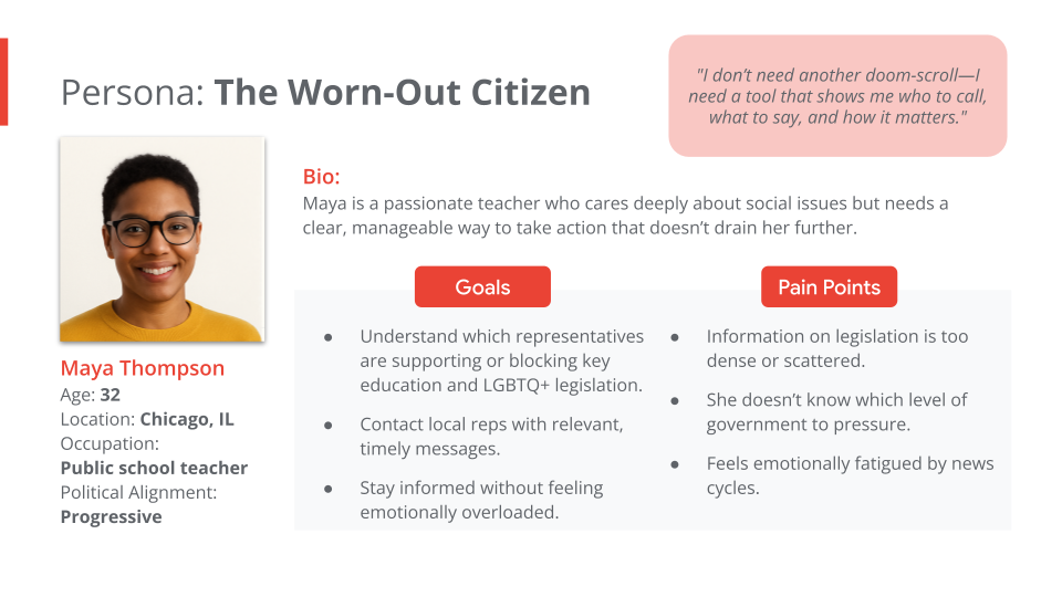
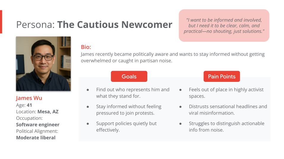
User Personas

Value Proposition
CivicLink empowers people to take informed civic action through location-based personalization, simplified legislative content, and accessible action tools. By facilitating informed engagement, the app strives to reduce political disillusionment and encourage users to take meaningful action on the issues that matter most to them. It turns political overwhelm into confident, values-aligned participation.
Design Goals
Accessibility: Support for all abilities and tech comfort levels
Clarity: Use of plain language and clear visual hierarchy
Engagement: Build pathways that encourage repeat interaction and action
Develop

Designing the Solution
Ideation & Wireframes
Mapped out user flows and prioritized key tasks
Paper Sketches

Created clickable wireframes in Figma
Lo-Fi Prototype
Core User Flows
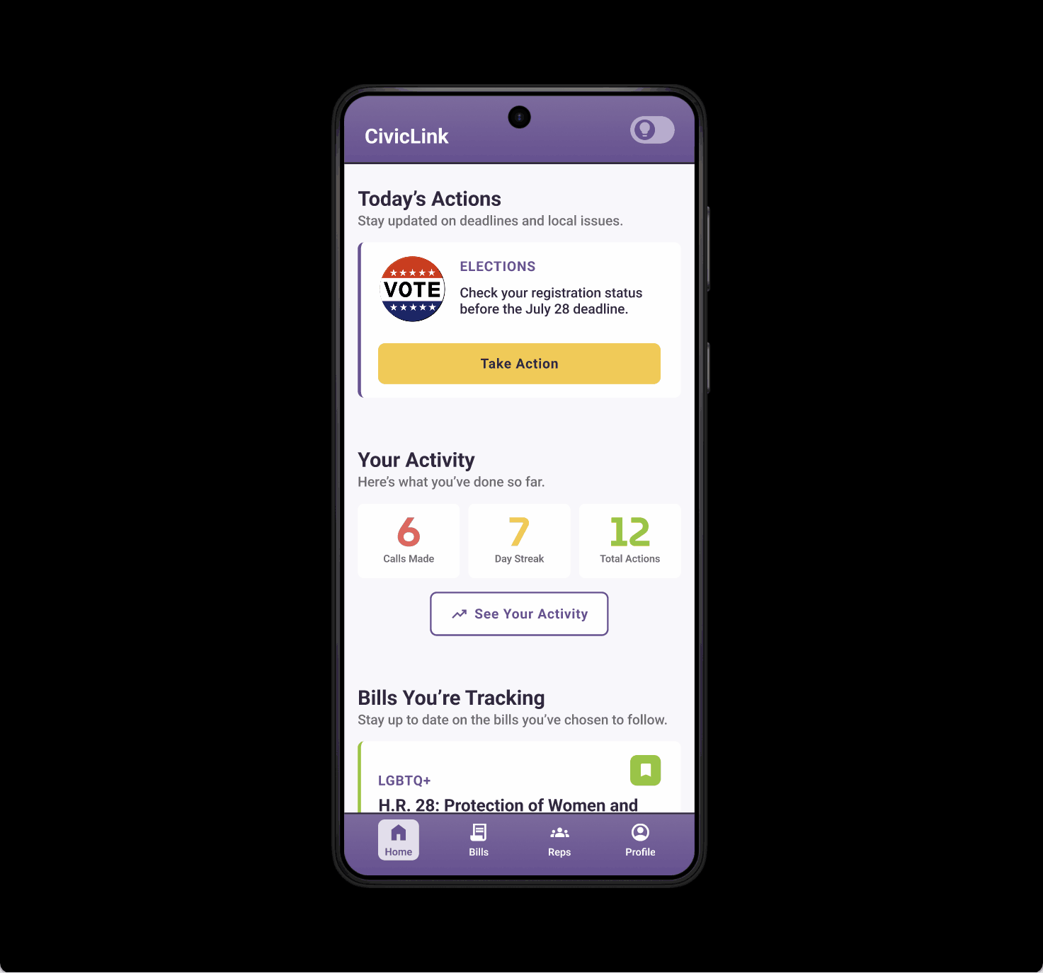
Key flows were designed with clarity, momentum, and simplicity in mind. Here’s how the app supports users from entry to action:
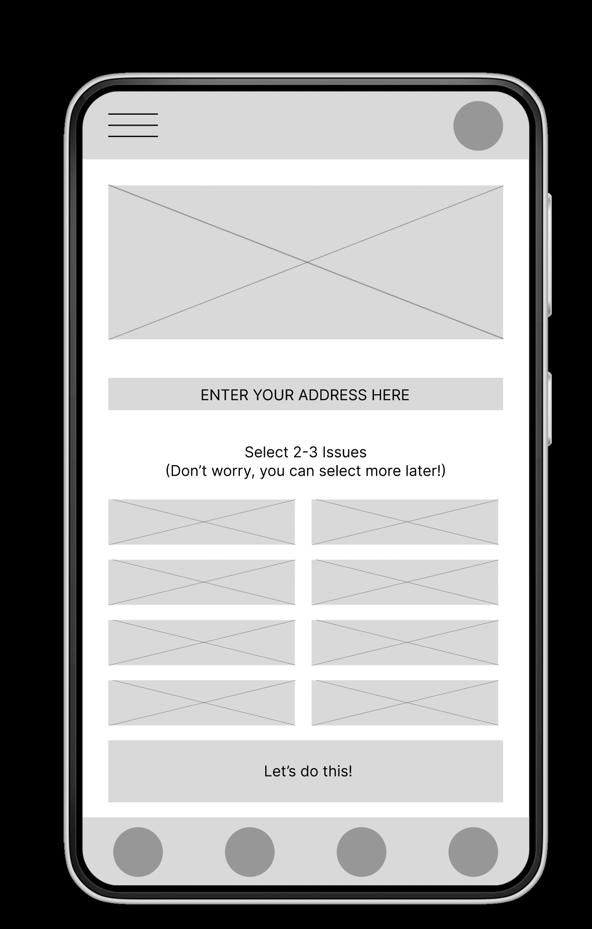
Onboarding Flow
A four-step process introduces users to the app while capturing essential personalization data:
Create Account
Users create an account without needing to connect through third-party services. Based on user feedback, single sign-on (SSO) was intentionally excluded to protect privacy and prevent political interest data from being shared externally.Set Location
Users can input their address or enable geolocation to automatically identify their voting districts and elected representatives.Select Causes
Users personalize their experience by choosing plain-language cause areas. These are thoughtfully mapped to legislative policy categories to improve accessibility, such as “LGBTQ+” instead of “Sex, gender, sexual orientation discrimination.”Take First Action
The final onboarding step encourages users to take an immediate, meaningful action, helping build momentum and confidence from the start.
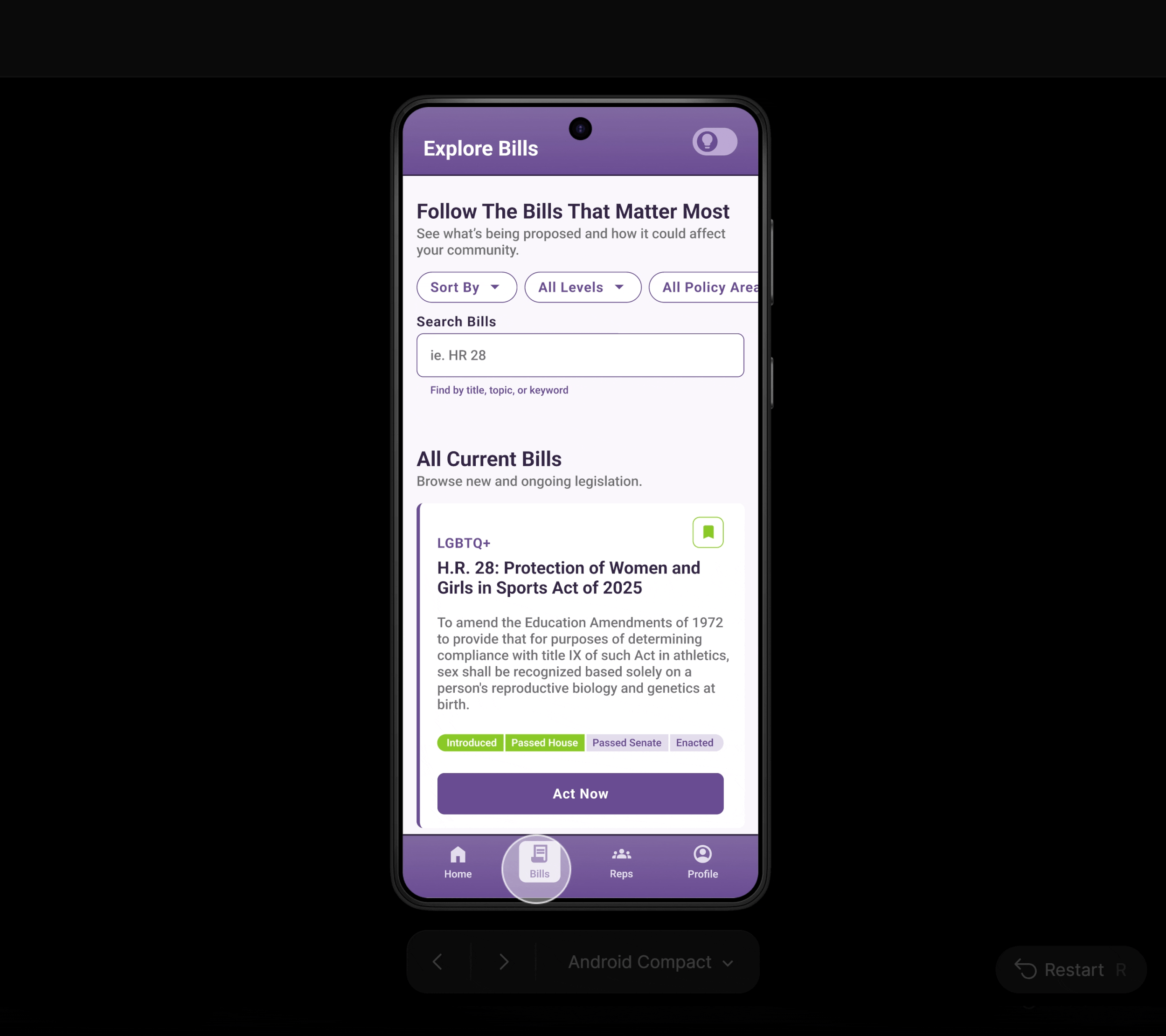
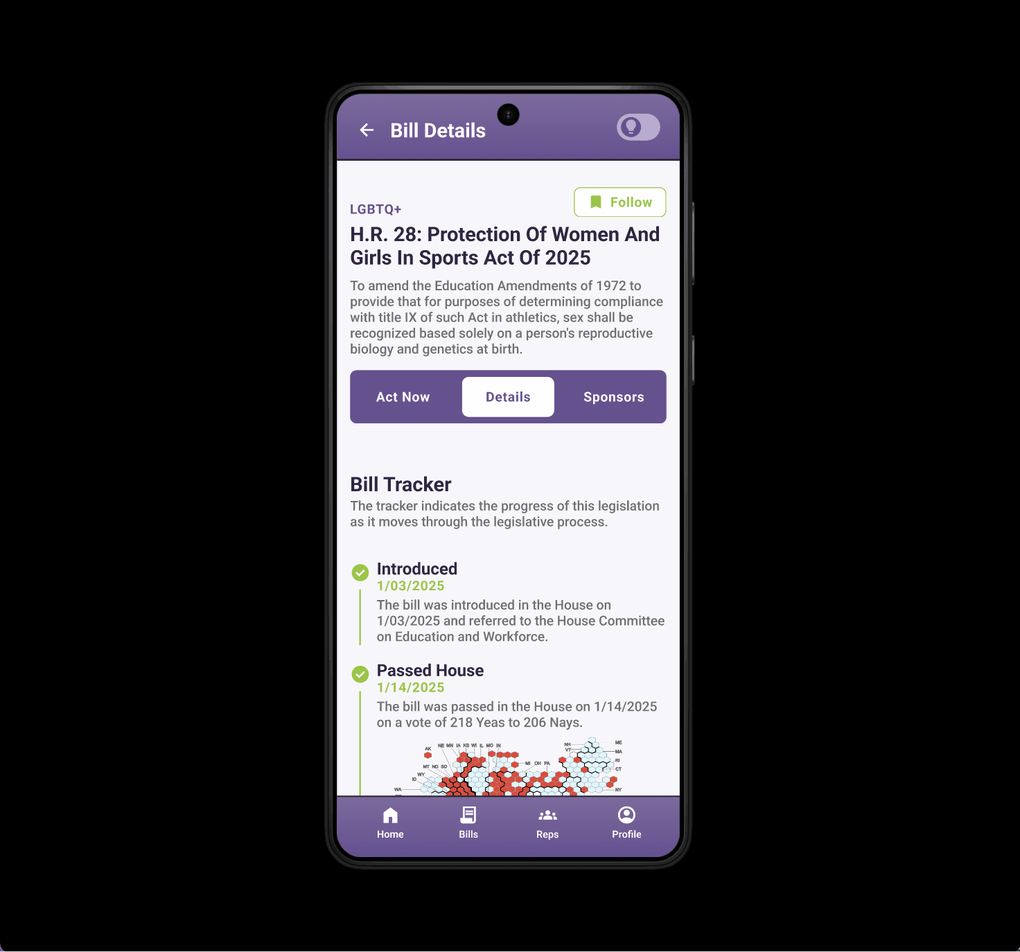
Taking Action on a Bill
A core user flow was designed to reduce friction and prompt immediate participation:
Act Now Tab: Users land on this tab by default when viewing a bill
Call Script Section: Pre-written, plain-language call scripts populated by user data encourage users to call their representatives
Make It Your Own: Optional fields allow users to personalize their message
Contact Blocks: Interactive cards display representatives with click-to-call functionality and visual call tracking
Share & Encourage: Users can easily share the action page or call outcomes with others to increase engagement
Key Design Features
Offer a direct action tab, full bill details, and bill sponsor breakdowns
Bill Pages
Visual summaries of contact info, fundraising, legislative activity, and voting records
Rep Profiles
Optional cross-referenced bottom sheets that explain complex concepts without breaking flow
Learn More Toggle
Content & Tone
Voice & Tone: Calm, confident, and plainspoken. The app guides without overwhelming and informs without condescending.
Reading Level: 8th grade
Copy Principles: Every sentence serves a purpose; avoid filler, build trust through clarity
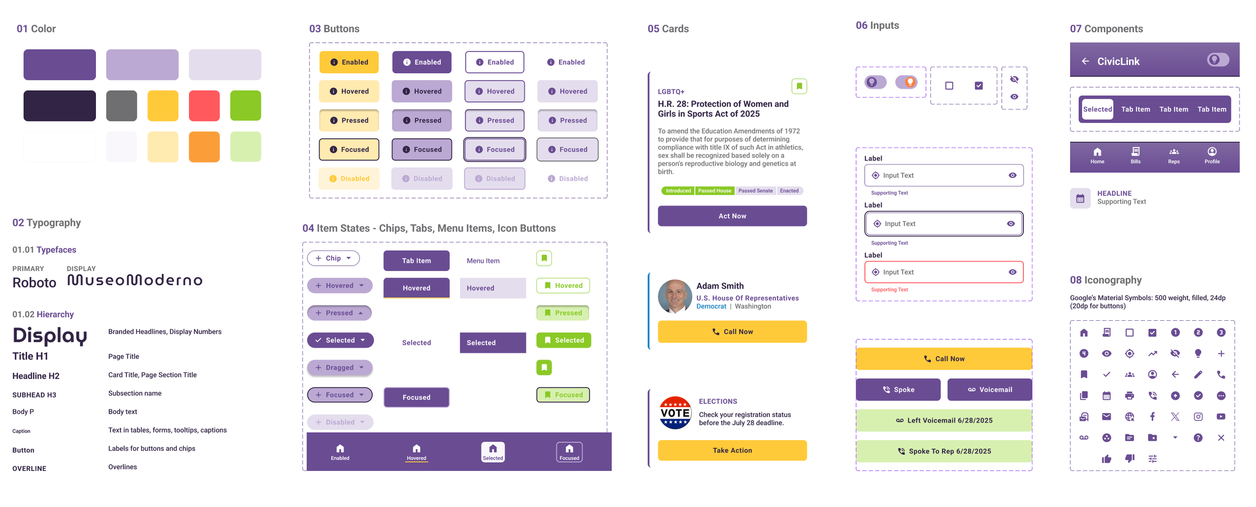
Design Style Guide
To ensure consistency and scalability, I developed a lightweight style guide outlining CivicLink’s visual language, tone, and component behaviors.
Typography & Color: Defined a flexible type scale and accessible color palette following WCAG contrast guidelines.
Components: Built reusable, documented components in Figma with clearly labeled states and variants (e.g., hover, disabled, selected).
Documentation: Included guidance for padding, spacing, grid behavior, and states to support consistency across screens and contributors.
Deliver

Final Design & Outcomes
High-Fidelity Prototype
Accessibility & Development Handoff

Semantic Layer Naming
Used consistent, role-based naming like Button/Primary, Header/MainTitle to promote accessibility and streamline design-to-code handoff
Touch Zones & Contrast
Designed with WCAG 2.1 guidelines in mind
Data Integration Planning
API sources labeled in design blocks for seamless engineering collaboration (e.g., congress.gov, govinfo.gov)
Usability Testing
Of 25 users, 12 rated their experience a 5, 6 rated it a 4, and 6 rated it a 3. Only one user rated it a 2, indicating high satisfaction overall.
Overall Experience
17 users rated likelihood to recommend the app as 4 or 5, indicating strong potential for organic growth and trust within civic-minded communities.
Likelihood to Recommend
15 users reported feeling "Informed," 10 felt "Empowered," and 7 felt "Curious." Only 3 reported feeling "Overwhelmed," suggesting strong alignment with the app's goal of demystifying civic engagement.
Impact on Confidence
Reflections on Testing Efficacy
Content Sensitivity: Placeholder legislation choice likely affected user perception—future studies will include user filtering or neutral bill selection to prevent bias
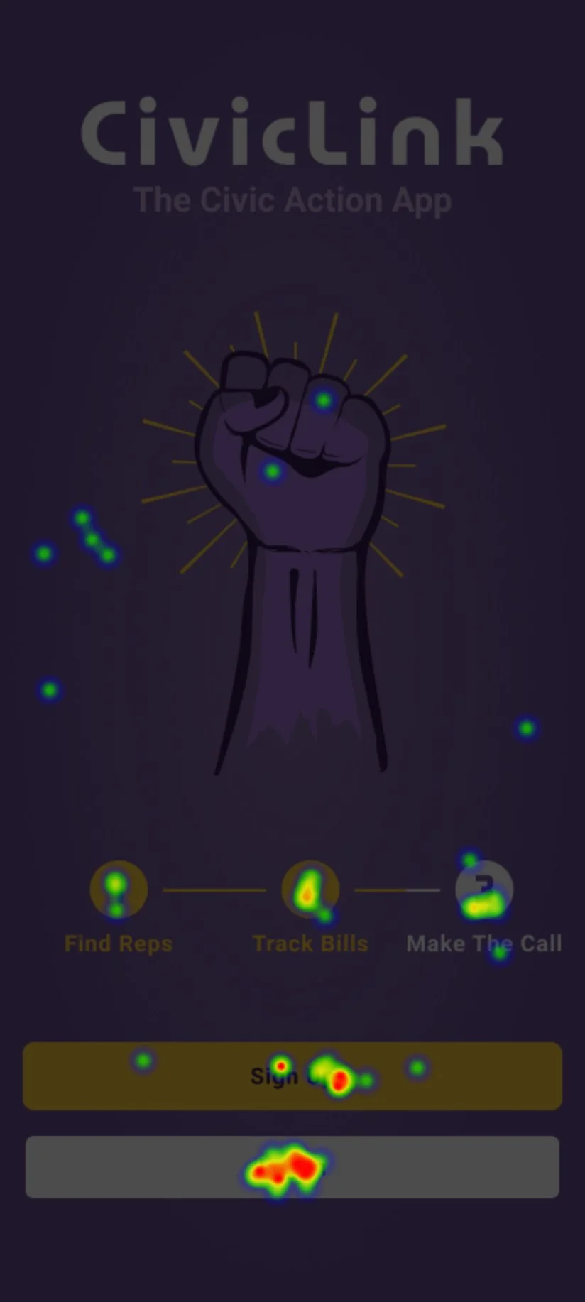
Heatmap testing produced insights on user behavior that led to design revisions, such as on the Welcome Screen. I reworked the screen to reduce misclicks and improve clarity after observing user confusion during usability heatmap testing
Heatmap Testing


Next Steps: Proposed Product Roadmap
Partner with a developer to build a cross-platform MVP using React Native
Implement high-priority features: onboarding, rep lookup, bill action flow
Refine copy and visuals based on usability insights
Set up database and integrate with public APIs (e.g., congress.gov, Open States)
Conduct closed beta test with civic organizations
Launch to iOS and Android stores
Short-Term
Add local event calendar tied to user location
Aggregate news feed by bill, issue, and representative
Implement dark mode with design tokens
Introduce gamification: personalized goals, streaks, and leaderboards
Develop notification system for bill updates and rep activity
Build out Action Center with integrations (ACLU, PEN America, etc.)
Launch public website with resources and advocacy toolkits
Long-Term
Reflection
This project reinforced the power of design in making democratic participation more accessible and meaningful. Through systems thinking, plain language, and inclusive UX, I created a tool that respects users' intelligence and enables real-world impact.
What I Brought to the Project
Systems thinking from service design
Learning scaffolds from learning experience design
Inclusive visuals grounded in accessibility best practices